Brightstar
My Role
Creative Director
Services
Brand Identity
Brand Strategy
Graphic Design
When IGT’s lottery division prepared to separate from the gaming business, they had an enormous opportunity sitting in front of them: redefine who they were and where they were headed. As Creative Director of the Yonder team, I helped to lead that transformation — from the strategic foundation to the visual and verbal identity that would launch the business into its next era.
The result was Brightstar — a name and identity built to signal momentum, optimism, and a new standard for a global lottery leader. A brand that steps out of the shadow of legacy infrastructure and into a sharper, more future-focused space in the industry.
Building a brand for
what comes next
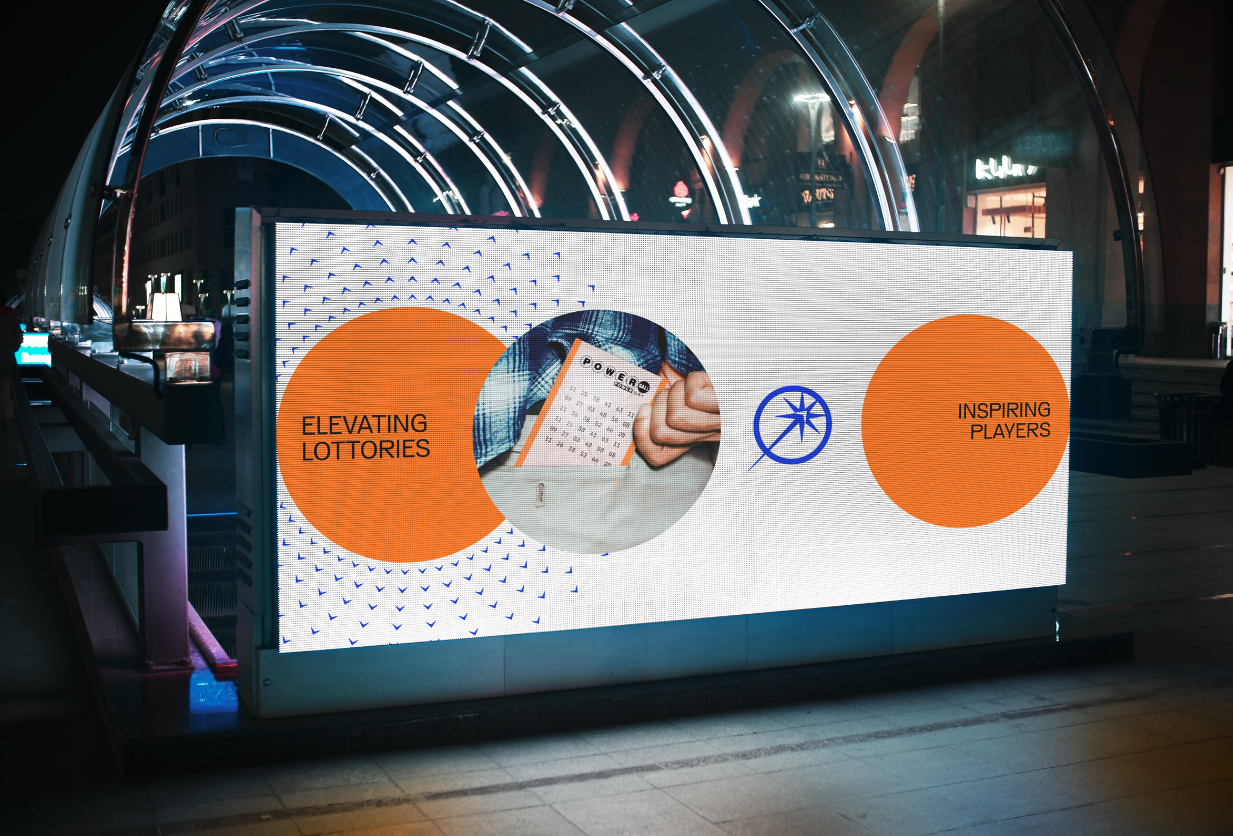
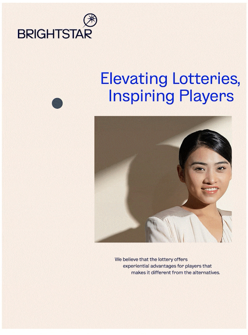
My role spanned across creative strategy, identity development, design direction, and the storytelling that helped internal teams understand not just what the brand was, but why the business needed it. The strategic idea, Elevating Lotteries, Inspiring Players, gave us a lens to stretch their perception beyond “technology provider” and into a partner shaping the full lottery experience — securely, creatively, and globally.
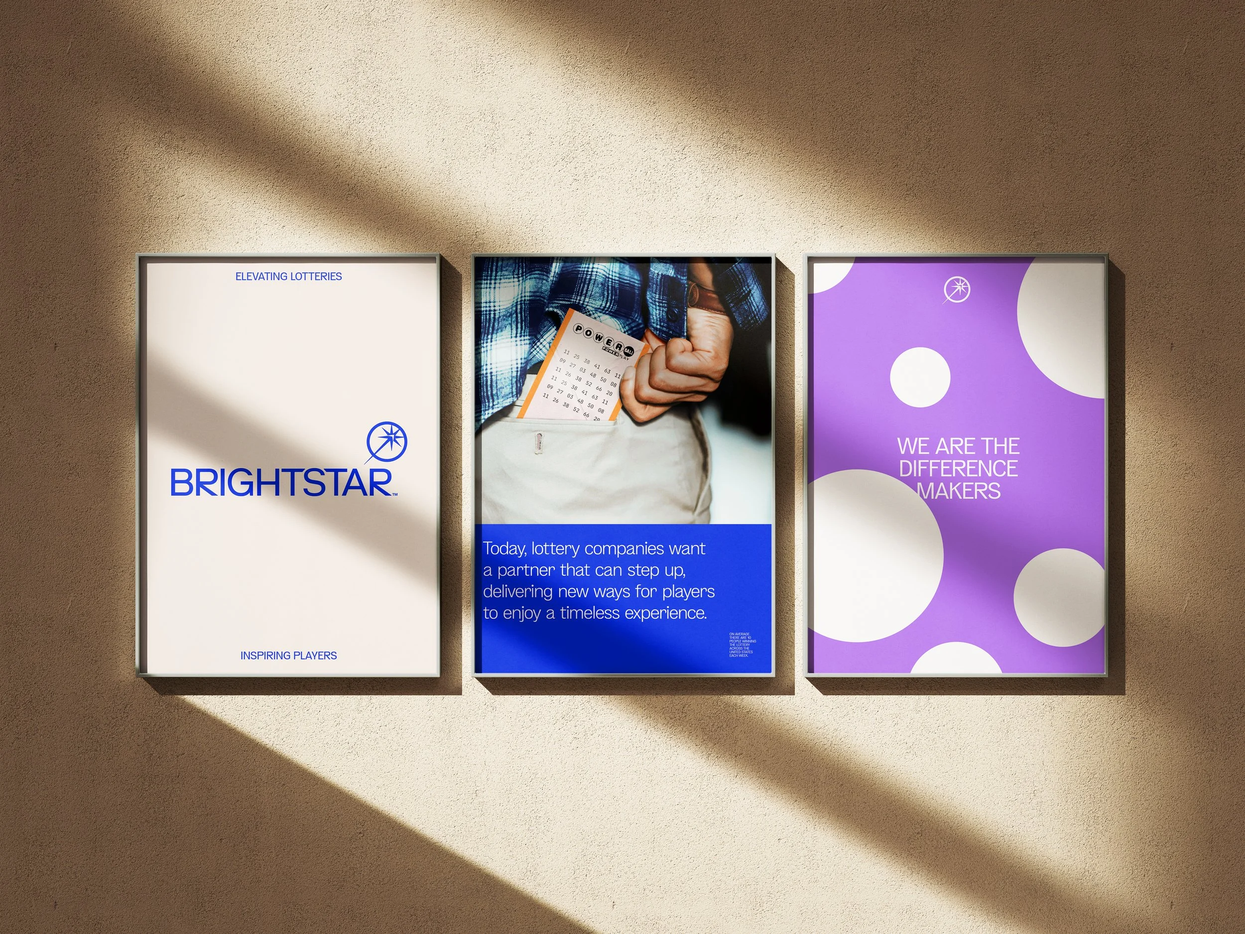
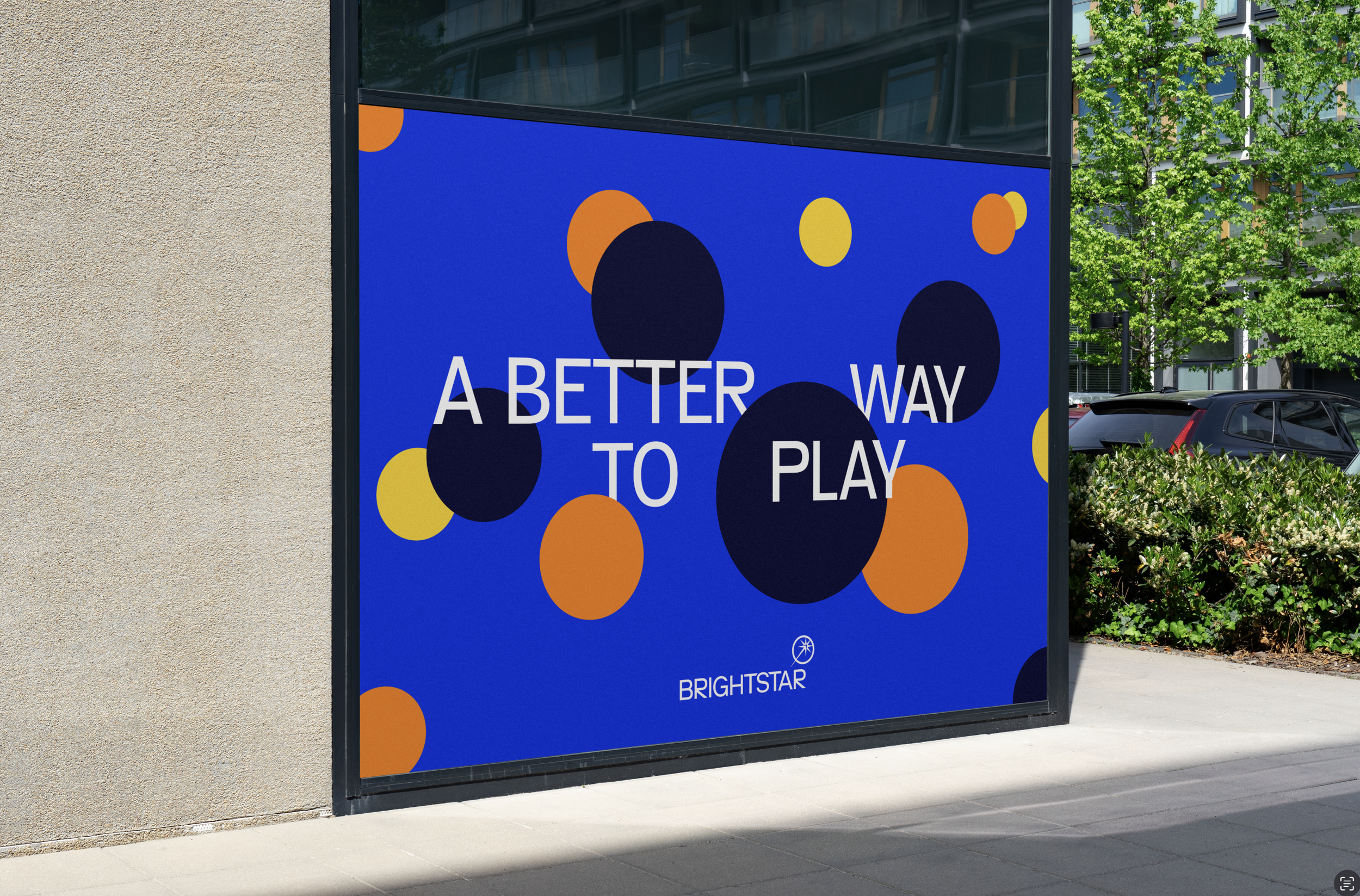
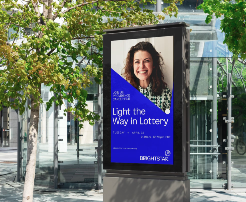
The visual identity came to life around the concept of The Zenith — the high point where clarity and aspiration meet. The new logo pulls from the 45º angle of refraction, symbolizing a shift in trajectory and a renewed sense of direction. From color to motion to tone of voice, every element was created to feel digital-first, confident, and unmistakably Brightstar.
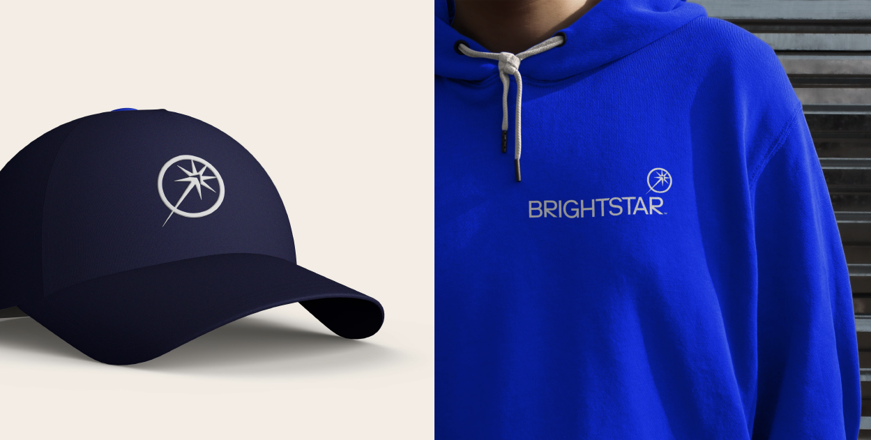
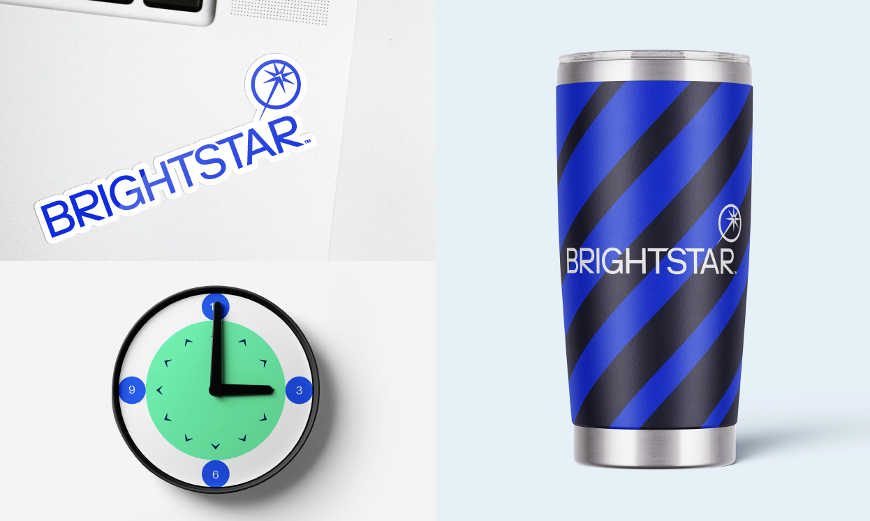
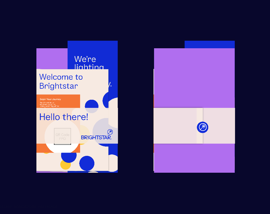
Beyond the logo, we built a graphic language rooted in the lodestar circles — a modern reinterpretation of the lottery ball, infused with the same upward energy as the Zenith. These circular expressions became the brand’s engine of movement: subtle enough to guide the eye in highly functional layouts, bold enough to create pattern, rhythm, and visual interest in more expressive moments. Because Brightstar serves multiple audiences — players, partners, government officials, and a global network of lotteries — the visual identity needed real range. The lodestar system gave them exactly that: a flexible, scalable toolkit that could dial up joy, confidence, or clarity depending on context without ever losing its center of gravity.
Brightstar is more than a rebrand — it’s a statement of intent. A new chapter for a business ready to lead with innovation, precision, and ambition. And for me, it became one of those projects that sits at the intersection of strategy and storytelling, where the identity isn’t just a look… it’s a call to action for the entire organization.
Project of Yonder Consulting
My role: Creative direction and brand design