Monster Careers
My Role
Creative Director
Services
Brand Identity
Brand Strategy
Art Direction
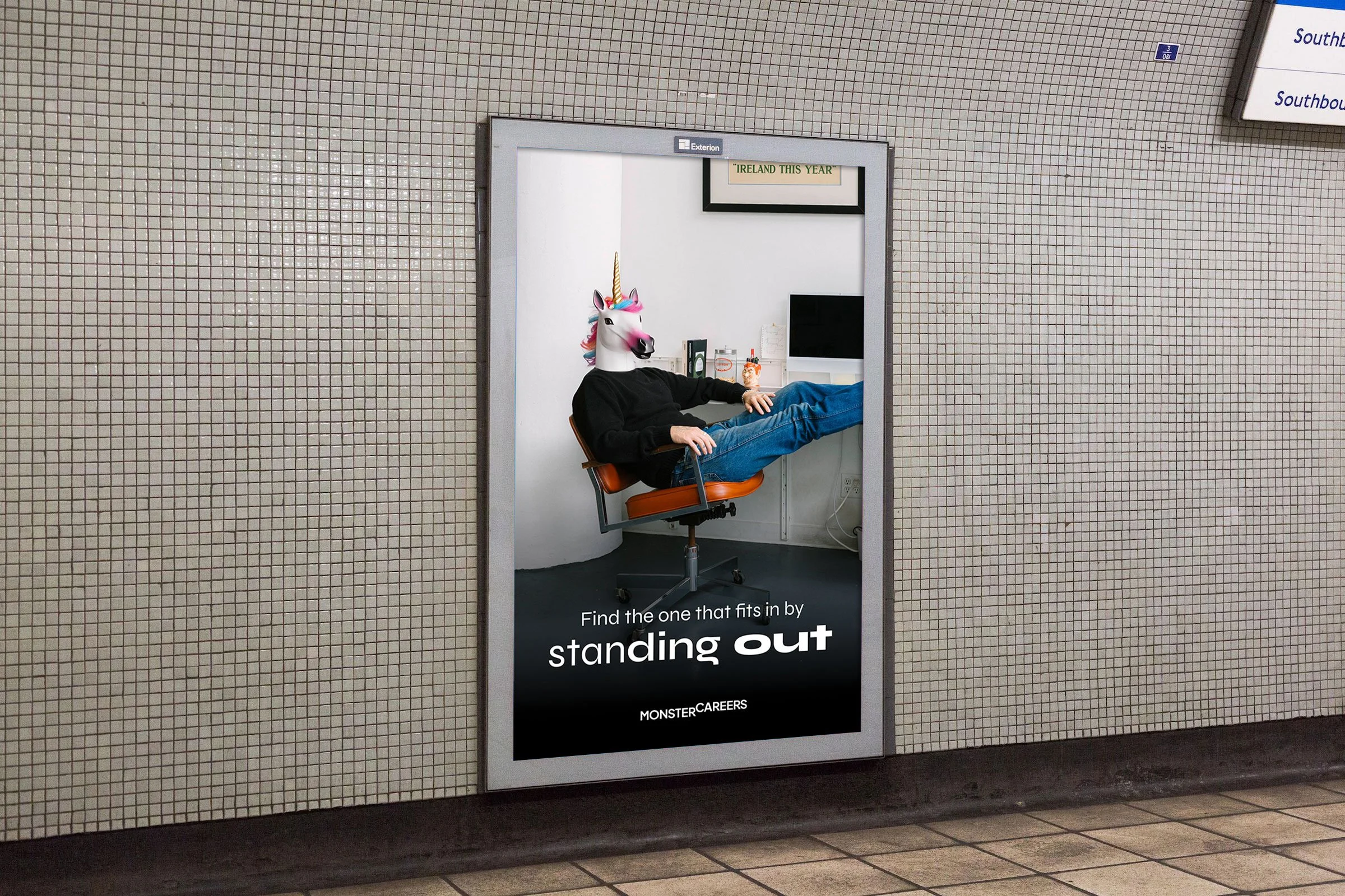
Bringing humanity back to hiring.
One Monster Moment at a time.
MonsterCareers came to us at a pivotal moment. Following the merger of Monster and CareerBuilder, they had the scale, the equity, and the ambition — but not yet the unified brand world that could carry them into the future. The hiring industry had become mechanical and transactional; the “magic” of meaningful connection was fading as technology overtook humanity. And yet, buried inside the brief was a clear opportunity: build a brand that didn’t just look different, but felt different — approachable, bold, warm, and unmistakably human.
As creative director, my role was to help shape that shift — translating a complex merger and an ambitious mission into a single, expressive identity system and tone of voice. The mission was clear: empower job seekers and employers by creating “Monster Moments” — those seamless, intuitive, confidence-boosting interactions where the process feels easy and the outcome feels inevitable. Everything we built laddered back to that idea: elevate the experience, highlight humanity, and make space for magic.
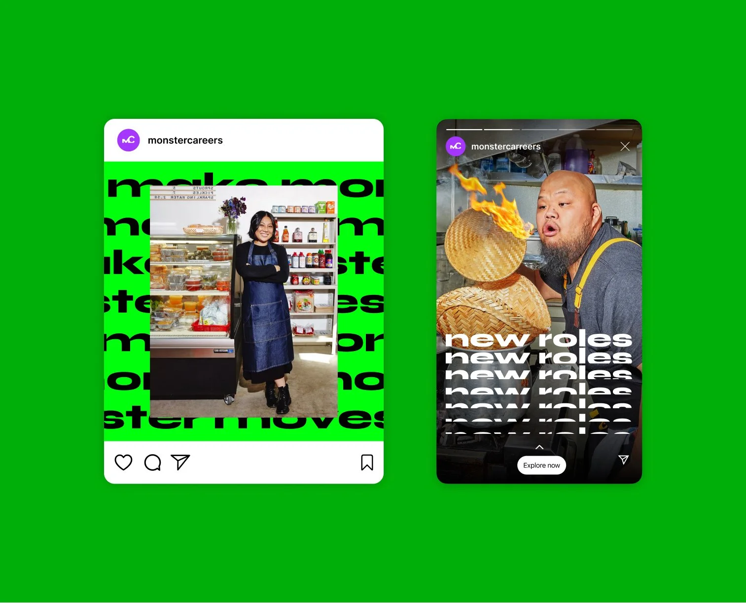
Visually, the brand needed to feel alive. We built a bold identity rooted in rhythm, scale, and emphasis — using echoed, “Monsterized” type to inject energy and intention into the simplest layouts. High-saturation workplace photography and candid people imagery grounded the system in real human stories, reinforcing the principle that humanity is at the heart of the hiring process. The logo — a fusion of the two legacy brands — captured the upward inflection of a career move, setting the tone for a modern, optimistic challenger.
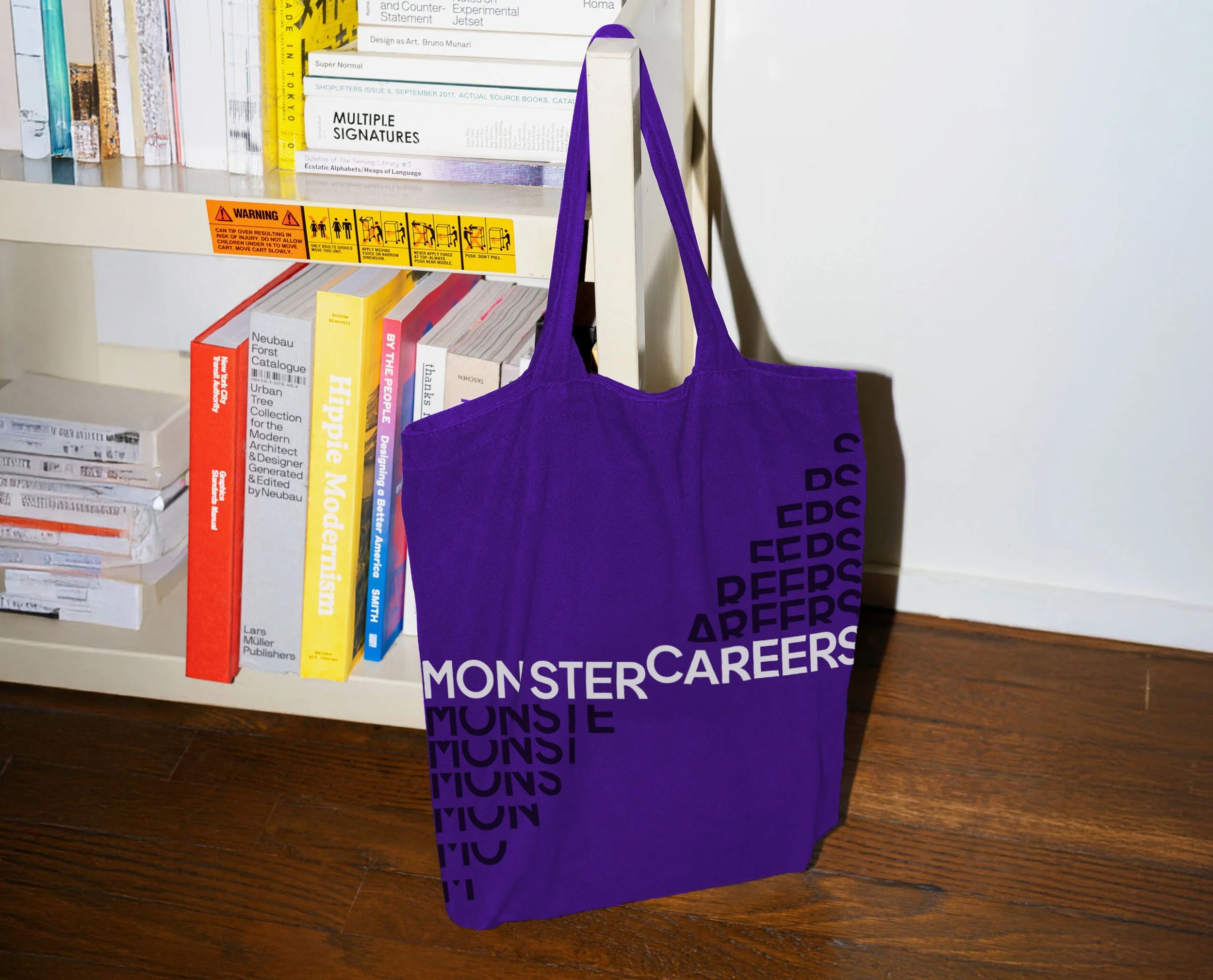
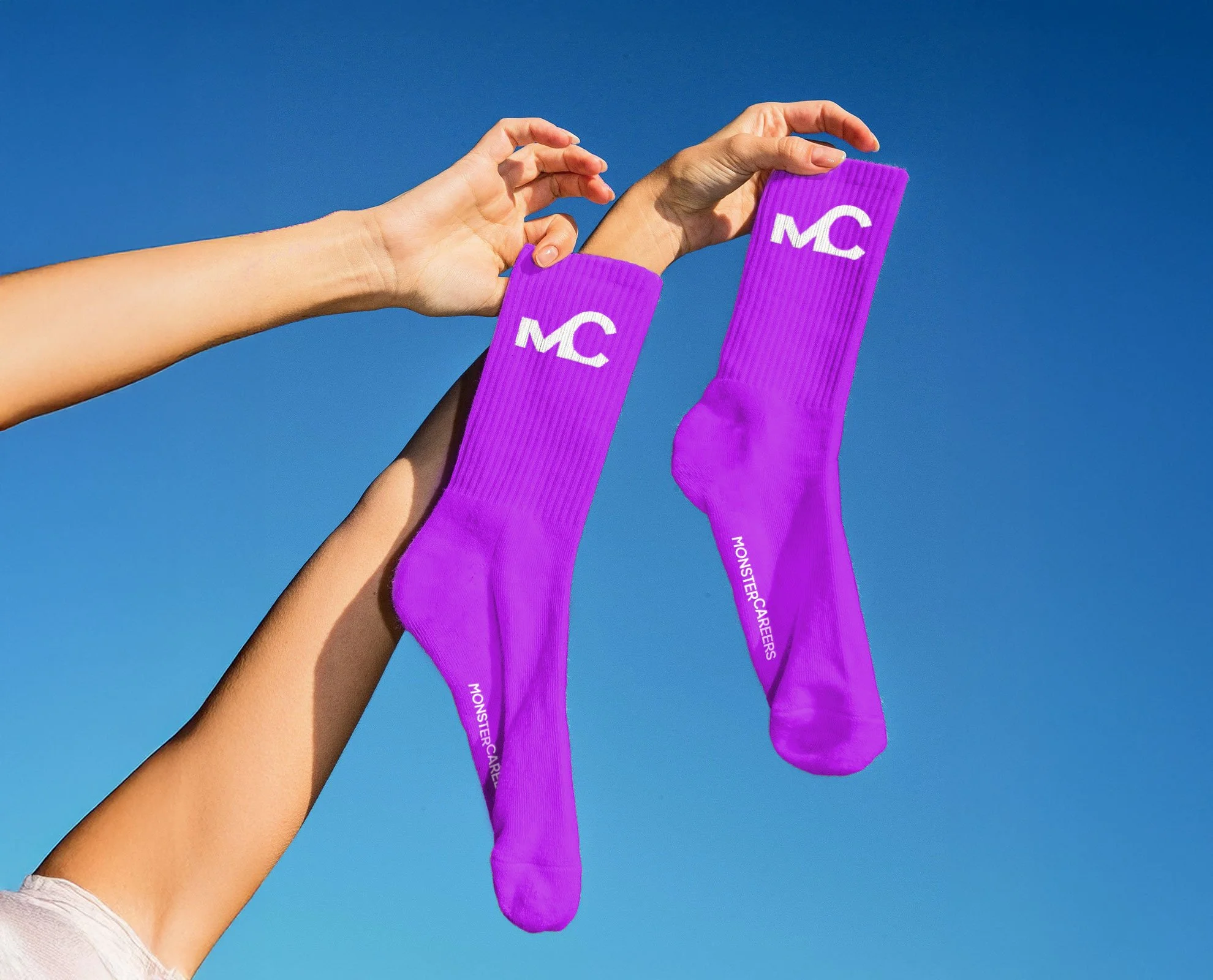
We extended the identity into a full design system: Monsterized icons, vibrant color ratios, intuitive UI, motion principles, and a flexible layout framework to ensure consistency across marketing, product, and experience. Every element ladders back to the brand’s creative principles: amplify meaningful impact, highlight humanity, and make space for magic.
Tone of voice became a cultural unlock. We crafted a voice that was grounded and witty — confident without being corporate, helpful without being saccharine, and always human. The copy avoids jargon, embraces clarity, and uses “Monster” as an adjective only when it adds momentum or delight — turning moments, not sentences, into something more meaningful.
The result is a brand built to flex across every touchpoint — from job seeker dashboards and employer products to social content, campaigns, and editorial. A system that spans high-volume digital environments and big-impact storytelling, always delivering one consistent promise: to make hiring feel magical again.